WordDevil Feedback wanted


(Darrin) #1

All,

Thanks again for your help. I’ve finally gotten this to a point to show and would love some feedback. Still a bit to do but mostly cosmetic. Need to add a pointer between the tiles. Also no sound yet. I really thought I could knock this out in about 120 hours but turned out to be much more.

http://www.playfulminds.com/word.html

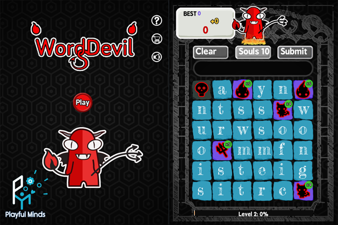
Welcome to WordDevil, a spelling game with new twists.

  1. Spin rows and columns to spell longer words. The longer the word, the higher the score with a minimum word being three letters and the longest word being ten.

  2. Besides letters, each tile can have one of four types of little devils. Each little devil has a shield rating between 3 and 6. Spell a word of that length next to the devil to beat it. For every little devil you beat, you get a score multiplier.

Watch out for the level 3 devil though–if you don’t spell an adjacent word in 30 seconds, it will turn into a unmovable grave.

  1. Graves stop you from spinning that row or column. But you won’t be stuck for long. Just use Souls to remove the graves. Press the Soul button to remove one at random. Extra Souls are earned by scoring points and completing quests.

  2. There are also three types of timed quests: Word, Score, and Devil.

a) The matching Word Quest has 500 devilish words, words like ghost, evil, dread. But don’t worry we didn’t forget the really scary words like clown, doll and, of course, diaper. Just spell the target word to complete.

b) The Score Quest requires that you score a certain amount of points within the time limit. You can either spell many short words or a few longer high scoring words to complete. Just don’t run out of time.

c) The Devil Quest requires you to beat a level 4 or higher little devil within the time limit. If you don’t have any devils, just spell more words to make them drop.

Quests get harder and faster with time. We hope you enjoy!

(Martí Angelats i Ribera) #2

I’d say a “Instructions” or “Help” button is needed. It is not intuitive enough for not having it.


(Martí Angelats i Ribera) #3

Another idea here. It’s about how it’s moving the columns and rows.

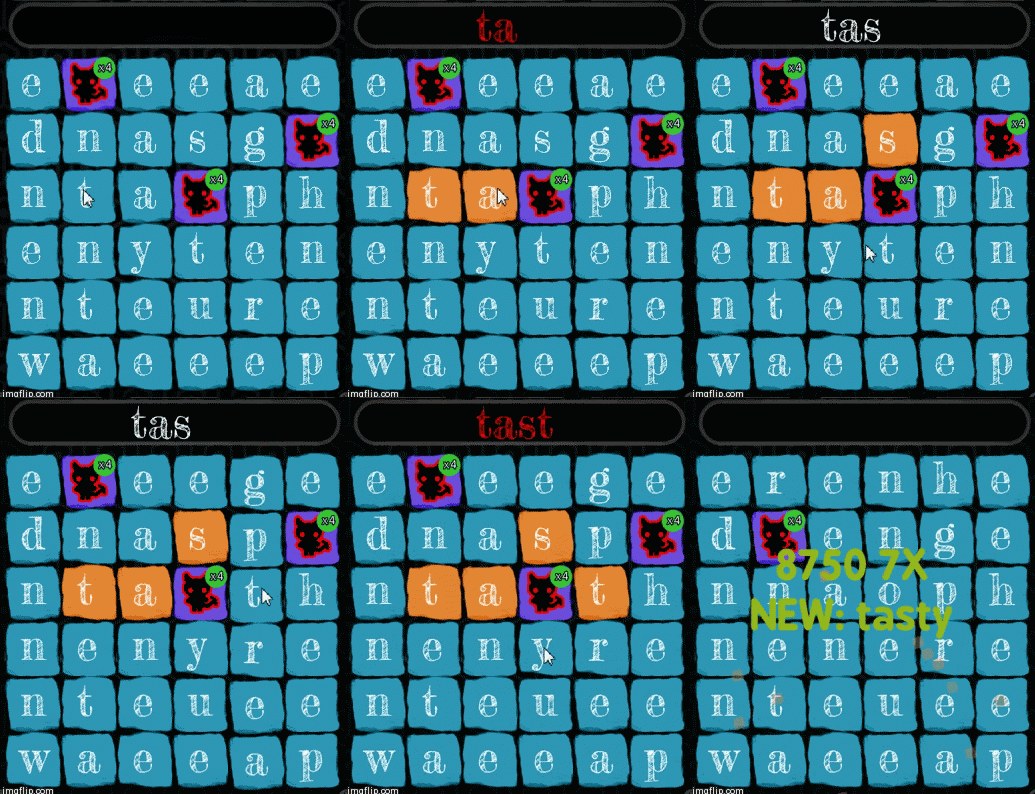
If i were you, i would make the moving calumn to be cutted and the same letter to appear (also cutted) at the other side. (Image to see what happens right now). I would also change The alpha of the one disapearing and the one apearing so it would be more visual. This is a visual improvment but i think it can make the game more intuitive.


(Darrin) #4

I like this. hmm, can I draw the same entity in two locations? Or would I dupe it?


(Martí Angelats i Ribera) #5

You can do it perfectly. You have to override the render function of the entity though (basically call graphic.render twice [one in each position]).


(Jacob Albano) #6

My first try I got to level 3 99% (score 59,790), and at that point I was totally out of vowels and couldn’t continue. I liked what I saw though. Here’s my feedback so far:

  • Vowel distribution is a big one here. Try weighting your letter choose by whether the board has any vowels in play, and possibly give Y less of an influence. Similarly, if there are no more vowels, the next tile to enter shouldn’t be a bonus.
  • Consider adding a function to replace a certain amount of tiles with a new random set. If I’m stuck with a lot of Vs and Xs, I might be interested in spending a soul to get a new selection. Giving souls another use is beneficial (in my opinion) because it introduces an element of choice; do I clear these graves off now, or wait for my letter pool to be full of letters I don’t want?
  • The font makes it difficult to tell some letters apart. I got Cs and Es confused a few times, and once thought an L was an I, though that one is more obvious. Tinting vowel tiles a slightly different color might be a good idea.
  • When you try to slide a row or column that’s being blocked, there should be some visual feedback. Maybe the whole row tries to move but it “bumps” into the grave and can’t go any further. Just something to show that the graves are what are keeping you from making that move.
  • Reset button! Refreshing the page works but it feels like a hack.
  • The level up screen doesn’t feel like it deserves a dialog. Just a simple non-interrupting popup on the bottom should do it.
  • Sometimes I failed to destroy a powerup tile without understanding why. Just now (second round) I failed a quest because I couldn’t clear a trident off the field despite matching three words adjacent to it. Some sort of visual feedback when a bonus would be removed would be great, like a glow around it when a completed word would trigger it.
  • When you slide a row or column and you have selected letters in it, they shouldn’t become deselected as long as only letters in that row or column are selected. I worded that incredibly poorly but hopefully you get what I mean :wink:
  • Audio! Give every meaningful action some sort of sound effect. Put some music in the background, even if it’s just placeholder. Audio makes everything better.
  • On that note, some more juice wouldn’t go amiss (this is cosmetic though, so you may already be planning on adding it). I’d suggest a subtle screen shake when you destroy a grave, and a quick fade out on the score popup text instead of having them disappear right away.

It’s a cool game! My current high score is 112,750. What are your plans for it ultimately?


(Darrin) #7

Wow great feedback. I guess my spelling is worse than yours. I worried about running out of vowels but never could. But I was playing with less little devils. I’ll add that.

I’ve added everything to the list.

Yeah a long time ago I thought about souls to redrop the board. Not a bad idea. Bit of a button space problem but I’ll consider.

My plans is hopefully get on iOS, Android, EXE to get on FGL.com to see what happens. Still great feedback. That is more than a few weeks work :stuck_out_tongue:


(Jacob Albano) #8

Well, don’t take everything I said as gospel. I’m sure there’s some stuff in there that doesn’t jive with your plans. Good luck with sponsorships etc!


(Martí Angelats i Ribera) #9

The video is just too good. Didn’t know it. Thank you very much.


(Zachary Lewis) #10

Played the game for about 15 minutes and recorded myself playing. I’ll upload the commentary video once it’s finished encoding.


(Zachary Lewis) #11

There ya’ go.


(Jacob Albano) #12

WordDevil confirmed blind playthrough friendly.

The point about automatically consuming souls is a good one – as it is now there’s no reason to save them up, since you can’t target skulls for removal and they have no other use. Here are some possible approaches on that matter:

  • Change it so that graves are automatically destroyed whenever you have at least one soul in your counter. The problem here is that it’s not necessarily obvious what souls are good for, since the player never intentionally uses them.
  • Make it so clicking on a grave would prompt you to spend a soul to remove it (click again to confirm). This would introduce another element of strategy since it’s now up to the player which one gets removed. With this approach you could remove the Souls button and move the counter someplace less noticeable, since it’s not important to see them unless you’re about to spend one.

(Darrin) #13

@zachwlewis great stuff. yeah the soul button why have it? I like the idea of using it for some other purpose, like a complete board reset or something, because choice is really good. I got a little lazy and I should have put the graphic of the level 4 devil on the quest screen instead of just text. It is cool you did get to all the features in (minus 1 quest type) in 15 minutes. I also liked watching your careful play. Oh and the blinking little devil three is a good idea as well.


(Jacob Albano) #14

Another thing about the UI: here’s a quick and hideous mockup of how you might redesign the layout to take less space.

It would save you the space from two of your buttons at the moment, and would feel more native on mobile devices, if you go that way. I think this would be great on a touchscreen.

Tagging onto your last comment, having a screenshot of the appropriate bonus tile and the way to beat it (highlighted adjacent word of the correct length) on the quest screen would be really useful. Like I said earlier, I wasn’t clear on how to remove each type of devil at first, and an image like that would have done wonders to help me figure it out.


(Darrin) #15

@jacobalbano The juice video is great. Thanks! How to make your game juicer

The Gamasutra article that spawned it was good as well. I like the part about limiting your options improves creativity. While you can’t do a super, alpha blended flashy-ten thousand sprite shooter, you can still do a darn good one that could look very cool.


(Zachary Lewis) #16

For a touch device, this might need work. I think the buttons for “This is what I want, please submit it!” and “Nope! Cancel and delete this! It’s bad!” are too close to each other and would be prone to mistaps.

Additionally, it seems there’s no way to backspace currently, since clicking on a letter of a word that is “valid” will automatically submit it. If I tap a letter to highlight it, I expect tapping it again will un-highlight it. If I tap a letter not part of the current word chain, I expect my current word to be abandoned and a new word chain started with the letter I just tapped.